DIVERSITY
This project was done as part of a university project entitled, "Representation Of Information" and the theme of the project being Diversity.
The purpose of this project was to provide a series of infographics in order to portray the level of diversity amongst the students within the University across all campuses. As for my approach, I produced a series of posters intended to be placed throughout the London Underground, This was due to the fact that My university’s campuses are spread all over Central London, making the London underground a key source of travel for all students alongside the underground logo being a strong representation of London.
DRILLBOARD
This project was part of a university module called "Live Projects", within this I decided to create a small protest which was supposed to portray to my audience the positive outcome that Drill Music can have on the lives of the people involved whilst providing a fresh outlook on this very controversial genre of music.
The approach I took was to design posters and a magazine. The Posters served the purpose of providing a look into why these rappers produce such dark and violent personas, whilst the magazine, which is inspired by Billboard outlines the success a lot of these musicians have and how it can change their lives, helping them to stay off the streets.
SOCIAL MEDIA ISSA DRUG
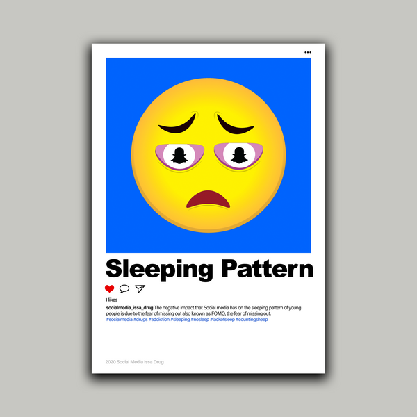
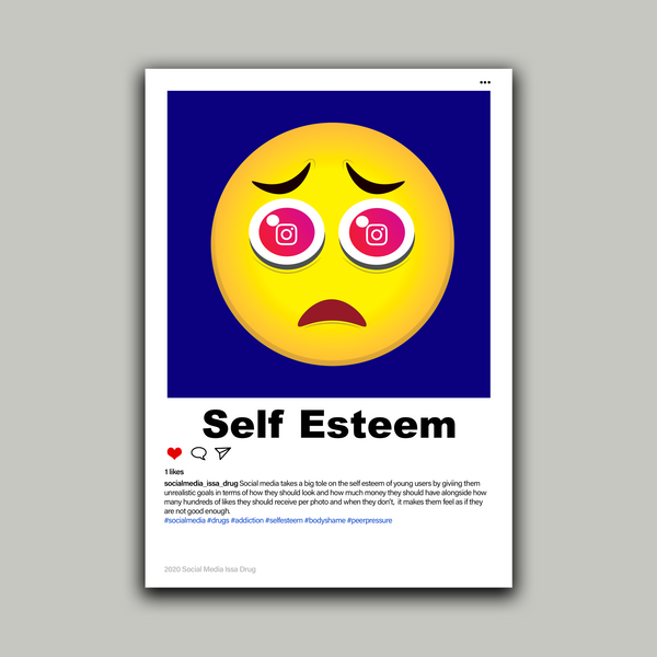
This was my final major project at university and by far my favourite, it was created in the form of a campaign in order to create awareness of how social addiction can have a negative impact on the well being and health of youngsters in the similar ways to drugs and alcohol.
The designs featured within this project were heavily inspired by the design layouts of social media giants Instagram and Snapchat, this is due to the fact that these two of the most popular used by youngsters as well as two of negative for their well being, in particular their self esteem. Did you know that 91% of 16-24 year olds use the internet for social networking which has been described as being more addictive than cigarettes and alcohol.
Also while designing my posters I decided that I didn’t want to portray my imagery the typical designer way which is usually done through colours or the use of negative space. I decided to instead appeal directly to my target audience aswell as sticking to the theme of my project by instead designing a range emojis each representing a different aspect of my project.
STOP HATE UK
This was an open design brief that presented me with the chance to create a project that deals with any issue that I'm passionate about either solving or creating awareness about. For my project, I decided to create a campaign with the sole purpose of promoting the equality of all people and races throughout the UK.
Usually within these types of campaigns artists more or less always use the same boring messages and imagery. I decided to take a different route through the usage of fruits. This was due to the fact like people fruits such as apples and coconuts come in various shapes and colours making them perfect examples to help portray the idea of diversity throughout my project.
OPEN DAY
These pieces were created as part of a typography brief, as a class, we were all tasked with creating an A3-sized poster along with an animated gif in order to advertise our university campuses' upcoming open day event.
For this task, we were only allowed to use typographic skills, hence why my designs lacked any other forms of imagery such as photography. Due to my target audience being my potential peers I decided that it would be a good idea to create something that appealed specifically to my age group (generation z).
This specific age group is heavily indulged in the use of technology and social media, as a result, I decided to make this the theme of my project. Being able to only use typography I had to incorporate this idea into my text resulting in the glitch theme seen in the pieces below, giving my project an almost hacker like theme.
VISUAL REPRESENTATION
This piece in my opinion was one of my weakest whilst studying at my university however it was one of my most popular amongst my class and lecturers due to my unique illustration style.
The purpose of this project was to create a piece of artwork that portrayed a journey and was entitled "Point A to Point b". I decided to create a piece that depicted to my audience how one bad decision could lead to a range of others and potentially ruin your life. In my piece for example a young boy's decision to become a drug dealer leads to a scenario of bad choices, eventually landing him in prison.

PROFESSIONAL PRACTICE
For this brief me and my classmates were split into groups and tasked with creating a pop-up studio. The purpose of this brief was to prepare each of us for a real-life working environment as well as teach us to be able to work as part of a team.
I feel like this brief really taught us the importance of being able to communicate with our peers effectively, this included being able to express concerns or uncomfortableness alongside being able to confidently present ideas and designs in front of a team. This task also taught us the importance of meeting up outside of working hours in order to make sure that everyone was up to date with tasks and most importantly comfortable within their role and understood the task at hand.
In order to completely embrace our design brief and promote our studio, me and my team decided to create everything from uniforms to social media alongside a range of posters and brochures all of which included information about our team and when our pop up studio would be taking place.


